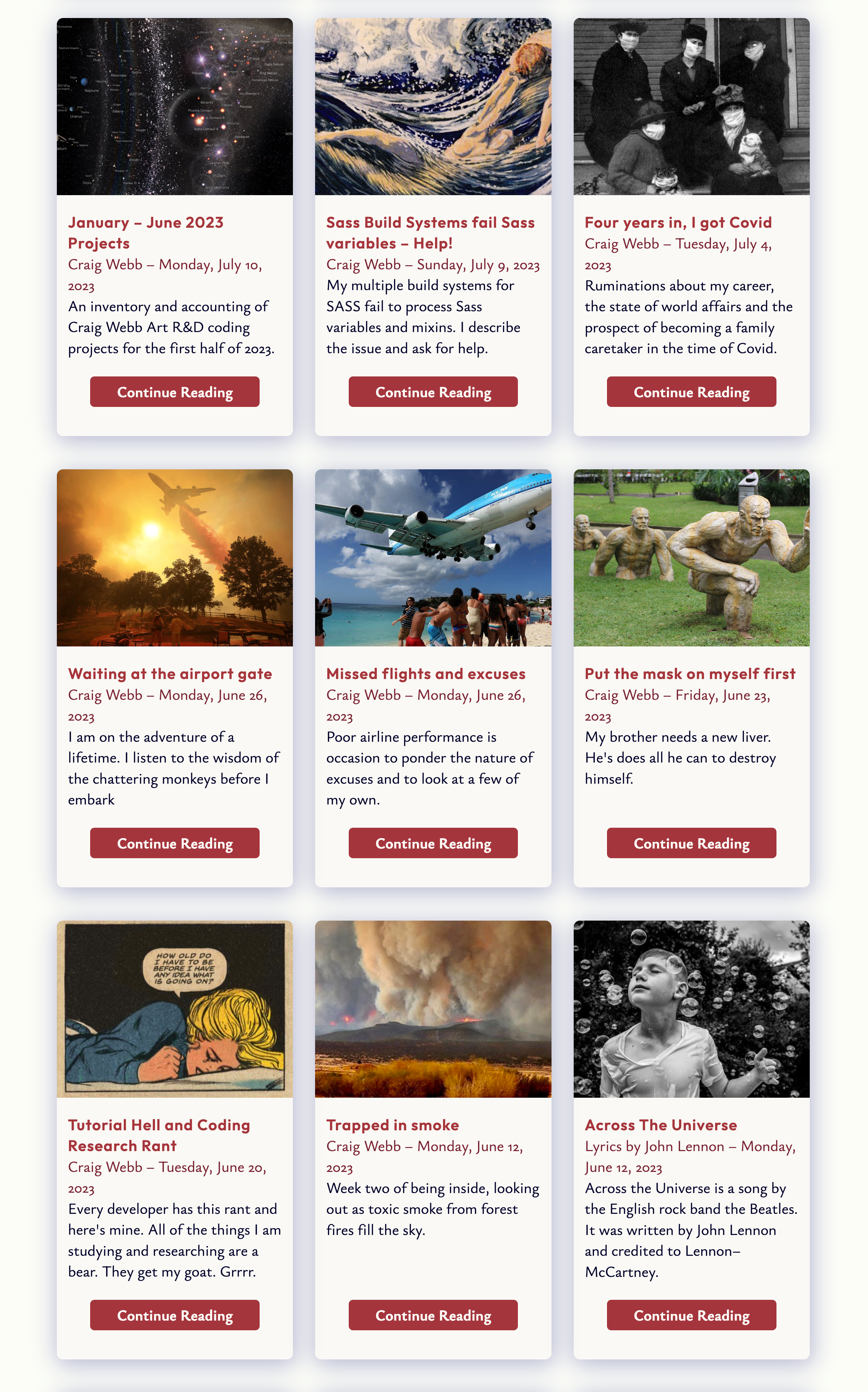
January – June 2023 Projects
"The Past is not dead. It is not even Past."
– William Faulkner, Requiem for a Nun
Recently while working on new research and development tutorials, I crossed paths with projects that I worked on earlier this year and forgot.
I am building a library of ready-to-go components using a variety of new CSS and JavaScript programing techniques. I need to remind myself of what I've done. This post is a list and description of prototypes and projects from the first half of 2023.
My list of Projects, January – June 2023
-
Sass Build Systems, Node, Gulp, and Eleventy
WordPress Custom Block Theme from scratch
Parallax
CSS Intersection Observer with scrolling animation & transitions
CSS View Transitions API (Page Transitions w/o JavaScript)
Trigonometric functions in CSS
CSS Value Functions
CSS Color Filter Properties
CSS + JavaScript a11y Tabs - progressively enhanced
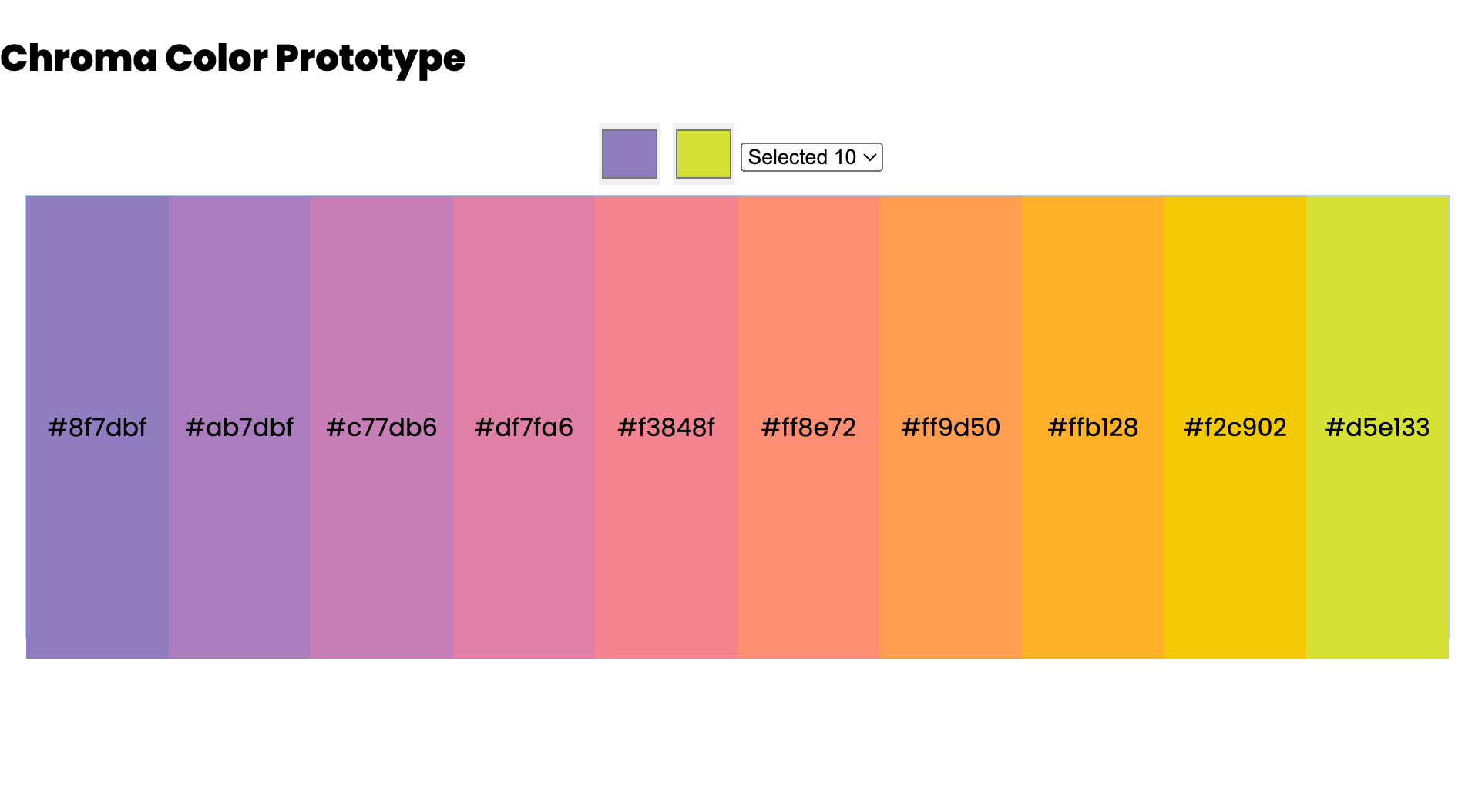
Chroma.js Color Library, New CSS Color Spaces
JavaScript Local Storage
Eleventy JamStack web development
Eleventy Blog posting on Netlify.com
CSS Cards
Single-card-pattern
Desktop / Mobile Card (Pair-programing-challenge)
Pair Programing, Meetup and Discord
CSS Grid
Grid-Sticky-Footer
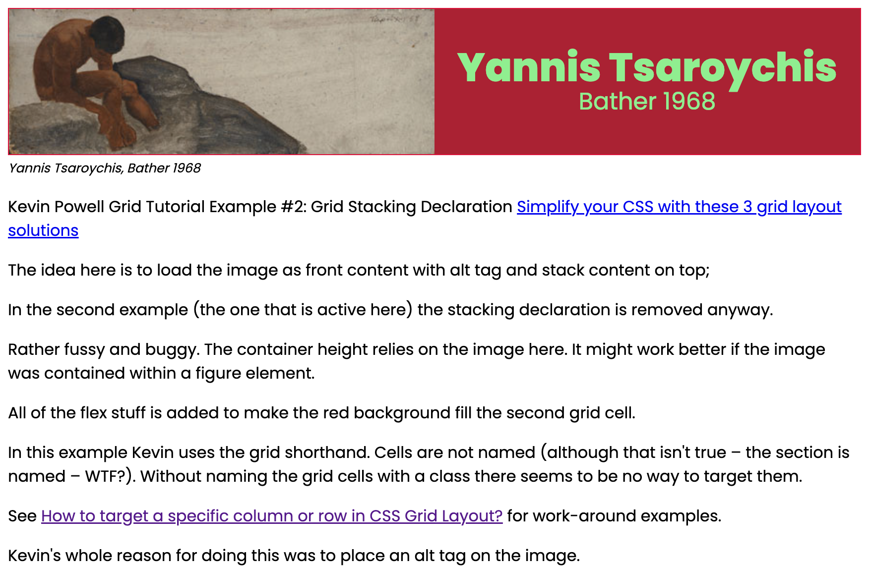
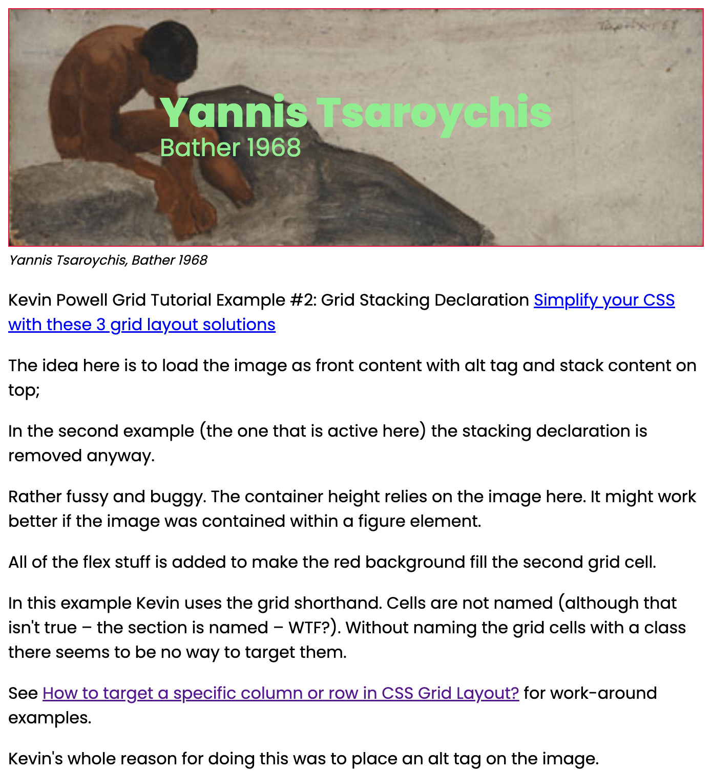
Grid Stacking Declaration
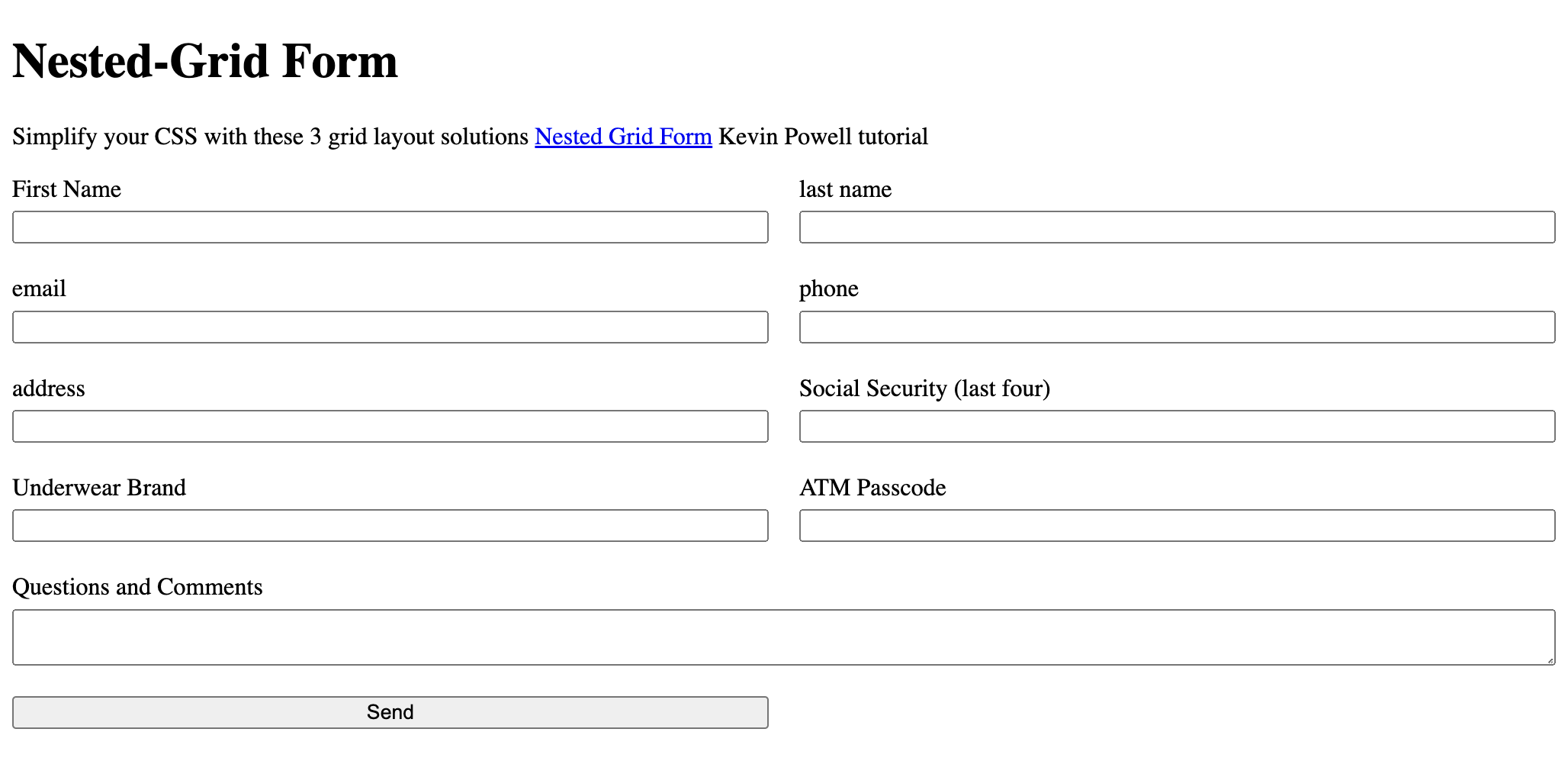
Nested-Grid Form
Grid Card-Layout
CSS Flexbox
Flex Card-layout
CSS Flexbox + Grid Bento-box Layout
CSS Card Layout for Eleventy Blog
Reverse engineer New York Times components
Floats
No-JQuery Lightbox
Triangle with CSS Clipping Path
Combining Prototype techniques
Sass Build Systems, Node, Gulp, and Eleventy
I started to update my front end design systems in October 2022. By January I built five or six. These systems help to automate work with Sass, image optimization and JavaScript. Of these, one system is built with Gulp, another works directly in Node. In addition, my Eleventy JamStack also processes Sass.
WordPress Custom Block Theme from scratch
In the Spring, I built a custom WordPress Block Theme for a client website. The WordPress Block Theme syntax is an evolving standard.
Parallax
Parallax is a design technique that uses CSS Translate and Zoom declarations to provide an illusion of depth and of design elements scrolling at different speeds. I worked from a tutorial provided by Keith Clark.
CSS Intersection Observer with Scrolling Animation and Transitions
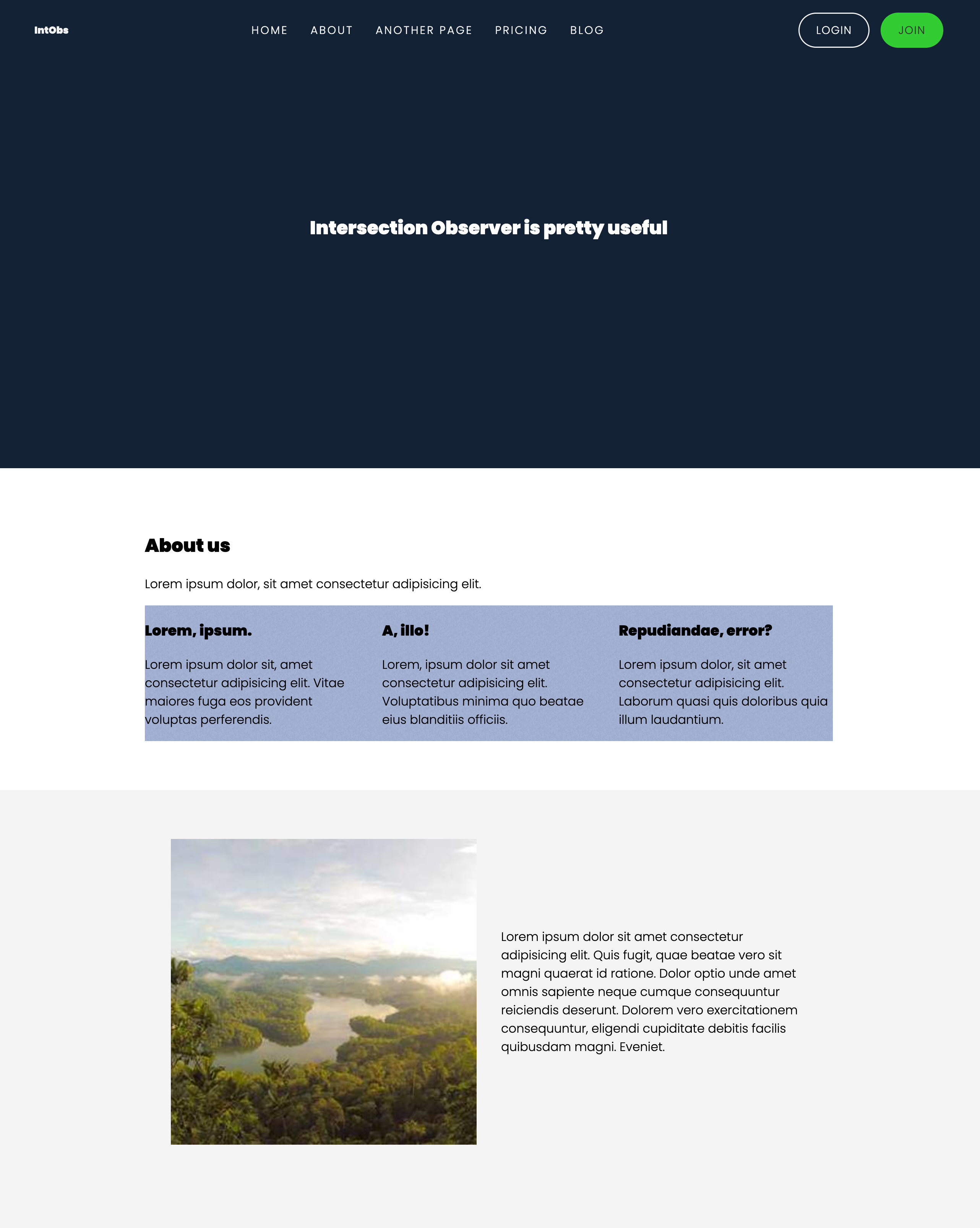
CSS View Transitions (Page Transitions without JavaScript)
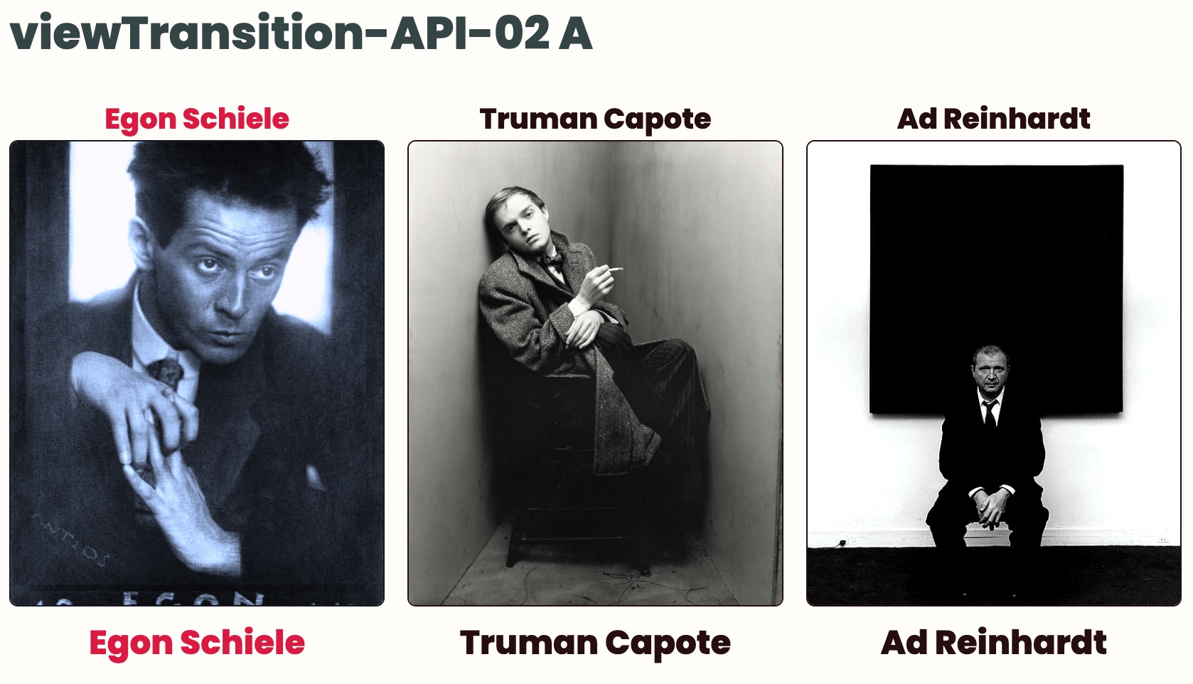
Individual page elements can also be targeted for transitions. I've also seen examples of View Transitions being combined with JavaScript. I will test a variety of patterns and techniques.
Trigonometric functions in CSS
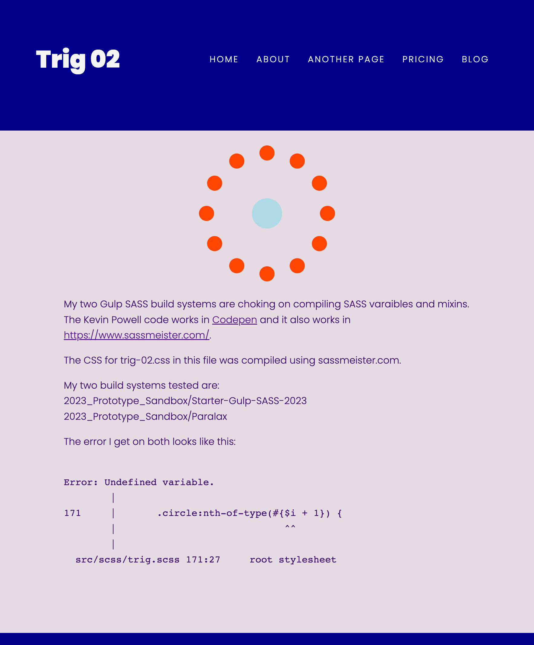
CSS Value Functions
Trigonometric functions is one of many CSS Value Functions. There is a long list. Included are other Math functions, Translate, Rotation, Scaling, and Skew functions, Matrix functions, Filter functions, Color functions, Image functions, Counter functions, Shape functions, Reference functions, Grid functions, Font functions, Easing functions, and Animation functions. Some of these I am using. Some I have yet to learn.
CSS Color Filter Properties
CSS Color Filter Properties are one set of CSS Value Functions. Any image or element can be altered by hue, blur, saturation, color and more. Filter properties can be stacked and chained together.
CSS + JavaScript Tabs with Aria-controls - progressively enhanced
Chroma.js Color Library, New CSS Color Spaces
JavaScript Local Storage
Learning JavaScript Local Storage is a step in the direction of creating my color app. I need to create a matrix by cross-interpolating one set of interpolations with a second set of interpolations. Local Storage is a method to store values and retrieve them.
Eleventy JamStack web development
Eleventy Blog posting on Netlify.com
I am still a baby about Netlify. My Eleventy blog is here. I am writing a lot.
CSS Cards – Single-card pattern
I have made many types of cards. This card component is a column format. This card has a headline, an image in a figure element, a text section, and a button. The card has a box-shadow. The card can be used anywhere – in grid, flexbox and vanilla HTML layouts.
Desktop / Mobile Card (Pair-programing-challenge)
Pair Programing, Meetup and Discord
This year I am active with Hacker Hours, Code & Coffee and a Writer's Meetup. I joined a Pair Programming Meetup where we meet on Discord. Pair Programmers work together on projects in real time. Pair Programming Meetup Programmers share their projects using VS Code and work across the Internet using LiveShare. In addition to this Pair Programming Meetup and Discord, I am also a member of Discords for Hacker Hours, Code & Coffee, OpenProps, StackOverflow, PostCSS, Storybook, Eleventy, and many more.
CSS Grid and CSS Flexbox
Grid-Sticky-Footer
Sticky footers are one of those patterns that seem to require repeated revisits. I already have a sticky footer designed in Flexbox. Years ago sticky footers required hacks to push the footer to the bottom of the page. I made this grid sticky footer pattern to have in case I need it.
Grid Stacking Text on Image
I add reference notes into my prototypes. This prototype notes say that the technique needs refinement. The header height is dependent on the image height. I usually put images inside a figure element. I need to create variations to see what works better.
Nested-Grid Form
Grid Card-Layout
This layout uses the column-card molecule I made. The cards are fluid width with a clamp. The layout changes from three columns to two, and one column for mobile width.
I tested both Grid and Flexbox for multi-card layouts.
CSS Flexbox
Flex Card-layout
This layout is the same as the Grid Card-layout except that it uses Flexbox. Odd cards expand to full width in this pattern.
I chose the Flexbox multi-card pattern to use for blog posts. In the blog version The odd extra card is modified with a width clamp so it does not expand.
Bento-box Layout using CSS Flexbox + Grid
Bento-box refers to a dish with various sized compartments to serve Japanese food. This layout uses a combination of flexbox and grid. It is not yet resolved for fluid layouts.
CSS Card Layout for Eleventy Blog
Floats
I built a set of float patterns that use CSS clamp to create fluid image widths for desktop and full-width images for mobile.
No-JQuery Lightbox
Soon To Come:
Create a Triangle with CSS Clipping Path
I am working on an app to choose coordinated colors. It requires a triangle-shaped layout. Making a triangle in CSS turns out to be complicated. CSS hacks exist to make an object that looks like a triangle but they are not really triangles.
Clipping Path is a CSS method to create polygon shapes. Ultimately I will need trigonometric functions to position elements within the triangle.
Combining Prototype techniques
I plan to incorporate and combine patterns for my Eleventy blog. I envision combining Image Floats with Lightbox. I will integrate Intersection Observer, Scrolling Animations, Transitions, and View-Transitions into my blog layout.
Reverse engineer New York Times components
I am in process of teasing apart the layout components in The New York Times. The New York Times might be characterized as a "bento-box" layout. It has large and small components of various sizes and patterns. Some of the small components appear to use a sub-grid layout.